import numpy as np
import pandas as pd
import plotnine as p9
import matplotlib.pyplot as plt

from matplotlib_inline.backend_inline import set_matplotlib_formatsNoto Sampling Evaluation
What is the best way to sample for diversity?
In this report we will take a look at the samples taken during the Noto campaign, which took place between 2014 and 2016, and solve once and for all the mystery of the anomalous S72.
We will analyze the different types of samples taken during the campaign, and compare them with regards to the duration and timing of the sampling.
Mainly, we’ll be looking at answering the following questions:
- What is the source of the anomalous S72 sample?
- Can we use this information to optimize the sampling strategy for the upcoming campaign?
- How does the cumulative diversity of the samples change with the sampling time?
- Are certain periods of the day better at sampling for diversity?
Preamble
Show code imports and presets
Imports
Pre-sets
# Matplotlib settings
plt.rcParams['font.family'] = 'Georgia'
set_matplotlib_formats('retina')

# Plotnine settings (for figures)

p9.options.set_option('base_family', 'Georgia')

p9.theme_set(
    p9.theme_bw()
    + p9.theme(panel_border=p9.element_rect(size=2),
               panel_grid=p9.element_blank(),
               axis_ticks_major=p9.element_line(size=2, markersize=3),
               axis_text=p9.element_text(size=11),
               axis_title=p9.element_text(size=14),
               plot_title=p9.element_text(size=17),
               legend_background=p9.element_blank(),
               legend_text=p9.element_text(size=12),
               strip_text=p9.element_text(size=13),
               strip_background=p9.element_rect(size=2),
               panel_grid_major=p9.element_line(size=1, linetype='dashed',
                                                alpha=.15, color='black'),
               dpi=300
    )
)
Campaign schedule and overview
We will start by taking a look at the schedule of the campaign, which in fact started on the 28th of July 2014, and ended on the 25th of March 2016.
A total of 94 samples of varying length were taken with a PM10 sampling head in a High Volume Sampler (HVS).
If we look at the daily coverage from 2014 to 2016:
Show Code
sample_timing = \
(pd.read_csv('../data/filters_inventory.csv')
 .query('location == "Noto"')
 .query('not sample_id.str.contains("b")')
 .assign(initial_date=lambda dd: pd.to_datetime(dd.initial_date),
         final_date=lambda dd: pd.to_datetime(dd.final_date))
 .assign(start=lambda dd: dd.initial_date + pd.to_timedelta(dd.start_time + ':00'))
 .assign(end=lambda dd: dd.final_date + pd.to_timedelta(dd.end_time + ':00'))
 .assign(week=lambda dd: dd.initial_date.dt.isocalendar().week.astype(int))
 .assign(weekday=lambda dd: dd.initial_date.dt.weekday)
 .assign(yearday=lambda dd: dd.initial_date.dt.dayofyear.astype(float))
 .assign(year=lambda dd: dd.initial_date.dt.year)
 .assign(start_h=lambda dd: dd.start.dt.hour)
 .assign(end_h=lambda dd: dd.end.dt.hour)
 [['sample_id', 'start', 'end', 'duration', 'volume', 'weekday', 'start_h',
   'end_h', 'week', 'yearday', 'year']]
)

nightly_samples = sample_timing.query('start_h > end_h')

corrected_nightly_samples = \
pd.concat([nightly_samples.assign(end_h=24),
           nightly_samples.assign(start_h=0, yearday=lambda dd: dd.yearday + 1)])

sample_timing = pd.concat([sample_timing.query('start_h <= end_h'),
                            corrected_nightly_samples])


(sample_timing
 .set_index('start')
 .resample('1D')
 .size()
 .rename('samples')
 .reset_index()
 .merge(pd.date_range('2014-01-01', '2016-12-31', freq='D')
        .rename('start').to_frame().reset_index(drop=True), how='right')
 .assign(year=lambda dd: dd.start.dt.year)
 .assign(dayofyear=lambda dd: dd.start.dt.dayofyear)
 .fillna(0)
 .pipe(lambda dd: p9.ggplot(dd)
  + p9.aes('dayofyear', 'year')
  + p9.geom_tile(p9.aes(fill='samples>0')))
  + p9.scale_y_reverse(breaks=[2014, 2015, 2016])
  + p9.scale_fill_manual(['gray', 'salmon'])
  + p9.coord_fixed(expand=False, ratio=40)
  + p9.scale_x_continuous(
    breaks=[32, 91, 152, 213, 274, 335],
    labels=['Feb 1', 'Apr 1', 'Jun 1', 'Aug 1', 'Oct 1', 'Dec 1'])
  + p9.labs(x='', y='', title='Noto Sampling Campaign Daily Coverage')
  + p9.guides(fill=False)
  + p9.theme(panel_grid=p9.element_blank(),
               title=p9.element_text(size=12)
)
)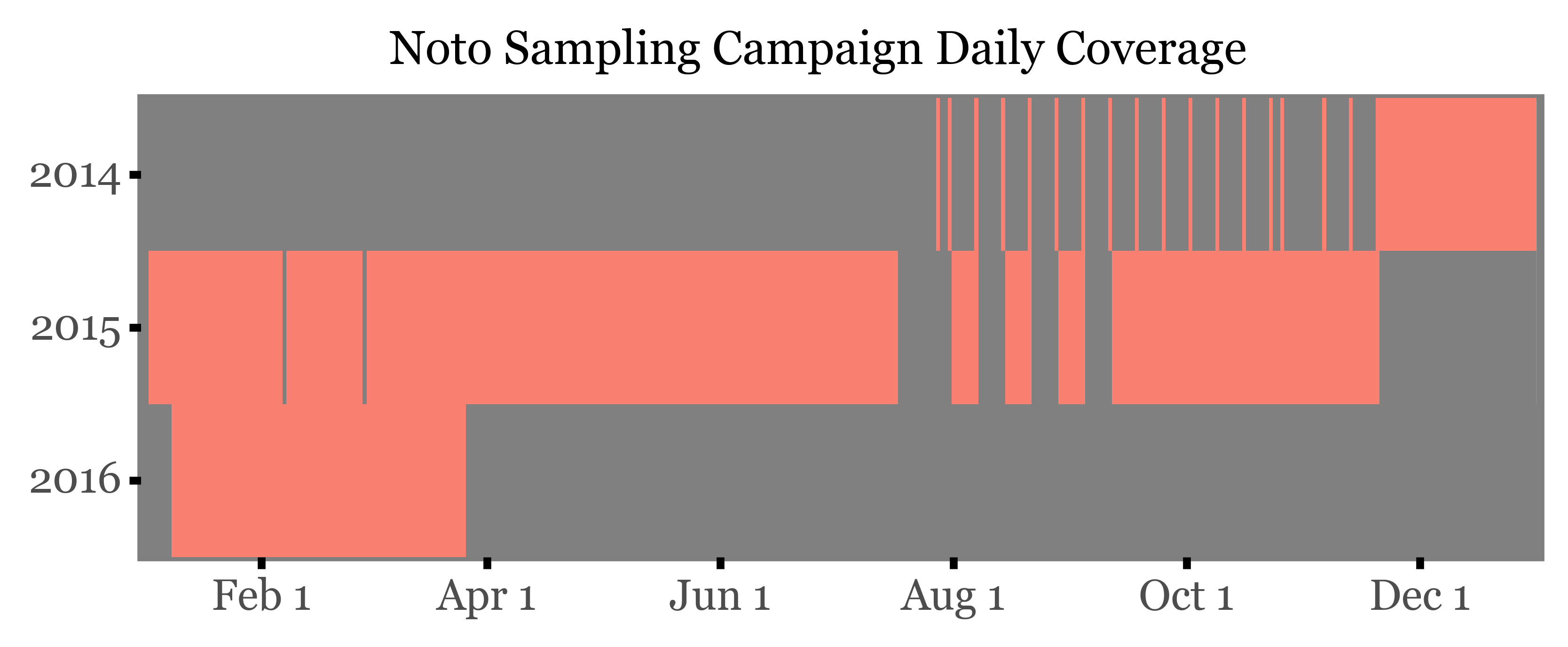
The start of the campaign in 2014 was marked by a number of samples where the sampling wasn’t properly set up, so that what were supposed to be weekly samples ended up being daily samples taken a week apart. This was corrected in the following weeks, starting at the end of November 2014, and from then on the sampling was done on a weekly basis, programming the HVS to sample from 12:00 to 15:00 every day and chaning the filter every week.
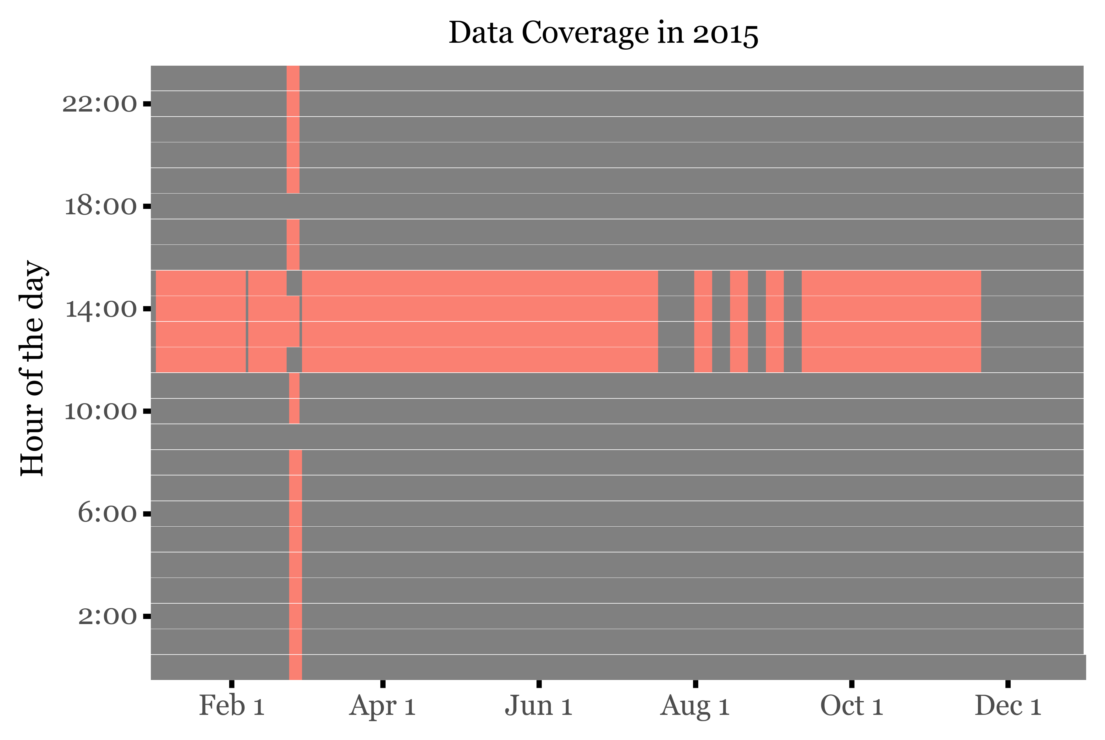
However, during February 2015, an intensive campaign was carried out, where the sampling was performed at a subdaily frequency by Sílvia and Roger. If we take a look at the hourly coverage of samples of the year 2015, this becomes evident:
Show Code
dates = (pd.date_range('2015-01-01', '2015-12-31', freq='h')
         .to_frame()
         .reset_index(drop=True)
         .rename(columns={0: 'date'})
)

samples_2015 = (pd.merge_asof(dates, sample_timing.sort_values('start'),
                left_on='date', right_on='start', direction='backward')
                .assign(sample_id=lambda dd:
                np.where(dd.eval('date >= start and date <= end'), dd.sample_id, pd.NA))
                .assign(sample=lambda dd: dd.sample_id.notna())
)

(samples_2015
 .pipe(lambda dd: p9.ggplot(dd)
  + p9.aes('date.dt.dayofyear', 'date.dt.hour')
  + p9.geom_tile(p9.aes(fill='sample', height=.98))
  + p9.labs(x='', y='Hour of the day', title='Data Coverage in 2015')
  + p9.scale_x_continuous(
            breaks=[32, 91, 152, 213, 274, 335],
            labels=['Feb 1', 'Apr 1', 'Jun 1', 'Aug 1', 'Oct 1', 'Dec 1'])
  + p9.scale_y_continuous(
            breaks=range(2, 27, 4),
            labels=[f'{x}:00' for x in range(2, 27, 4)])
  + p9.coord_fixed(ratio=10, expand=False)
  + p9.guides(fill=False)
  + p9.scale_fill_manual(['gray', 'salmon'])
  + p9.theme(panel_grid=p9.element_blank(),
             panel_border=p9.element_blank(),
             title=p9.element_text(size=12)
  ),
 )
)
If we now map the actual sample IDs to the sampling dates, and show the three different sample types (by duration), they look like this:
Show Code
sample_days = \
(sample_timing
 .groupby(['sample_id'])
 .agg({'start': 'min', 'end': 'max'})
 .assign(date=lambda dd: [pd.date_range(i, e) for i, e in zip(dd.start, dd.end)])
 .explode('date')
 .reset_index()
 .assign(weekday=lambda dd: dd.date.dt.weekday)
 .assign(week=lambda dd: dd.date.dt.isocalendar().week.astype(int))
 .assign(year=lambda dd: dd.date.dt.year)
 .assign(week=lambda dd:
       np.where((dd.date.dt.month==12) & (dd.week == 1), 53, dd.week))
 .groupby(['year', 'week', 'weekday'])
 .sample_id.unique()
 .reset_index()
 .assign(label=lambda dd:
       dd.sample_id.apply(lambda x: x[0].lstrip('S') + '-' + x[-1].lstrip('S')
        if len(x) > 1 else x[0].lstrip('S')))
 .assign(bigger=lambda dd: dd.label.str.len() > 3)
 .assign(group=lambda dd: np.where(dd.bigger, 'Sub-daily',
                          np.where(dd.label.isin(f'{i}' for i in range(23, 40)),
                           'Daily (3h)', 'Weekly (3h x 7d)')))
)

(sample_days.pipe(lambda dd: p9.ggplot(dd)
       + p9.aes('weekday', 'week')
       + p9.geom_tile(p9.aes(group='label', fill='group'), color='black')
       + p9.geom_text(p9.aes(label='label', size='bigger'), color='white')
       + p9.scale_y_reverse()
       + p9.scale_fill_manual(['#ab2422', '#D3894C', '#435B97'])
       + p9.scale_size_manual([6.5, 5])
       + p9.facet_wrap('year', ncol=3)
       + p9.coord_fixed(expand=False, ratio=.5)
       + p9.scale_x_continuous(labels=['Mon', 'Wed',  'Fri',  'Sun'],
                               breaks=[0, 2, 4, 6])
        + p9.labs(x='', y='Week of the year', fill='Sample Type')
        + p9.guides(size=False)
        + p9.theme(figure_size=(7, 7),
                    axis_text_x=p9.element_text(size=8),
                    panel_grid=p9.element_blank(),
                    panel_background=p9.element_blank(),
                    legend_position=(.25, .82),
                    legend_key_size=10,
                    legend_text=p9.element_text(size=9),
                    legend_title=p9.element_text(margin={'b': 7}),
                    )

)
)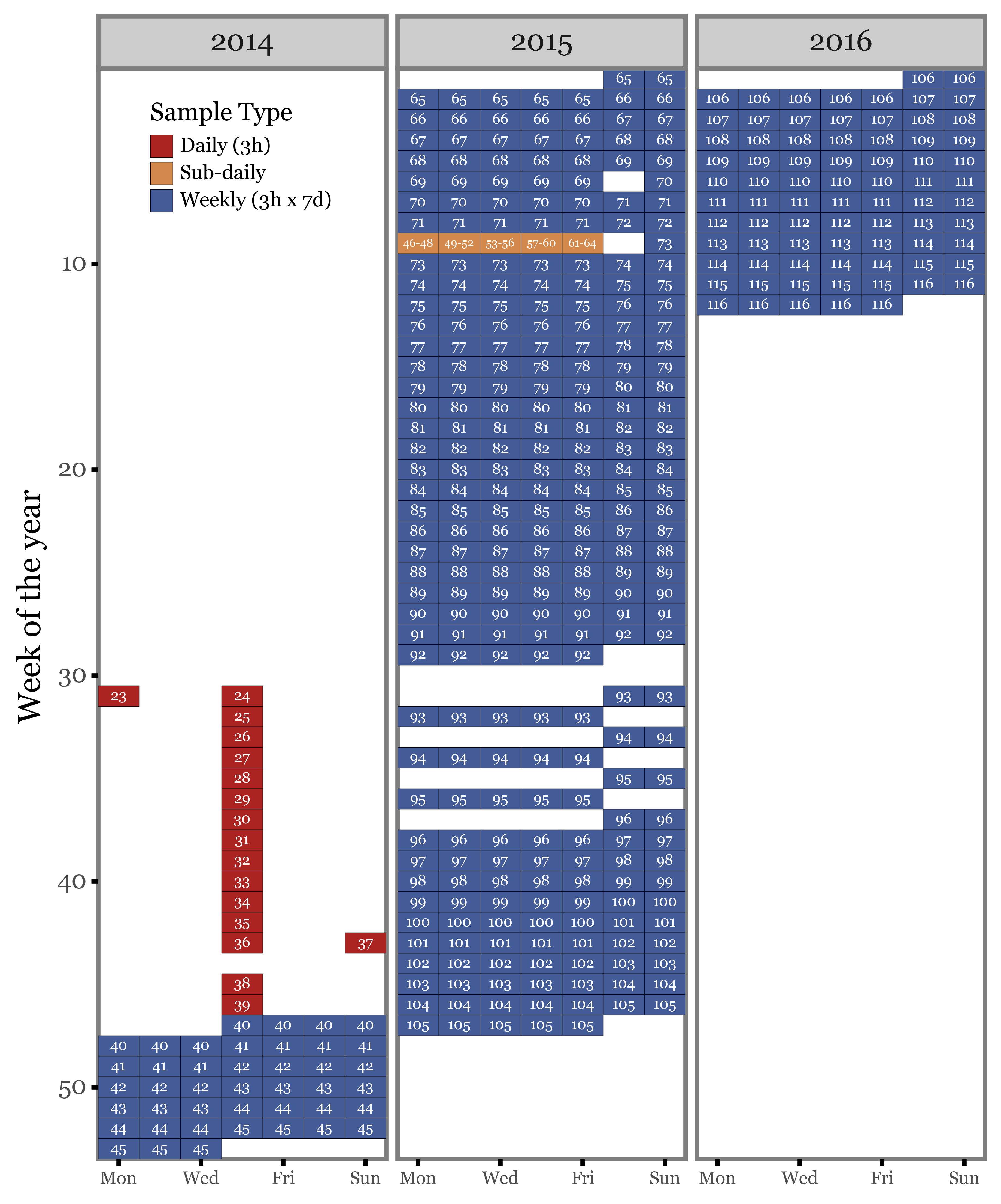
So, in total we have:
58 weekly samples. Almost all of them were generated by 7 days of sampling from 12:00 to 15:00 except for samples 70 and 73, which only had 6 days of sampling, and sample 72, which was interrupted after the second day to make way for the intensive subdaily campaign.
17 daily samples. These were generated by 1 day of sampling from 12:00 to 15:00 and taken a week apart from each other.
19 subdaily samples. These were generated by sampling at diferent hours of the day from the 23rd to the 28th of February 2015.
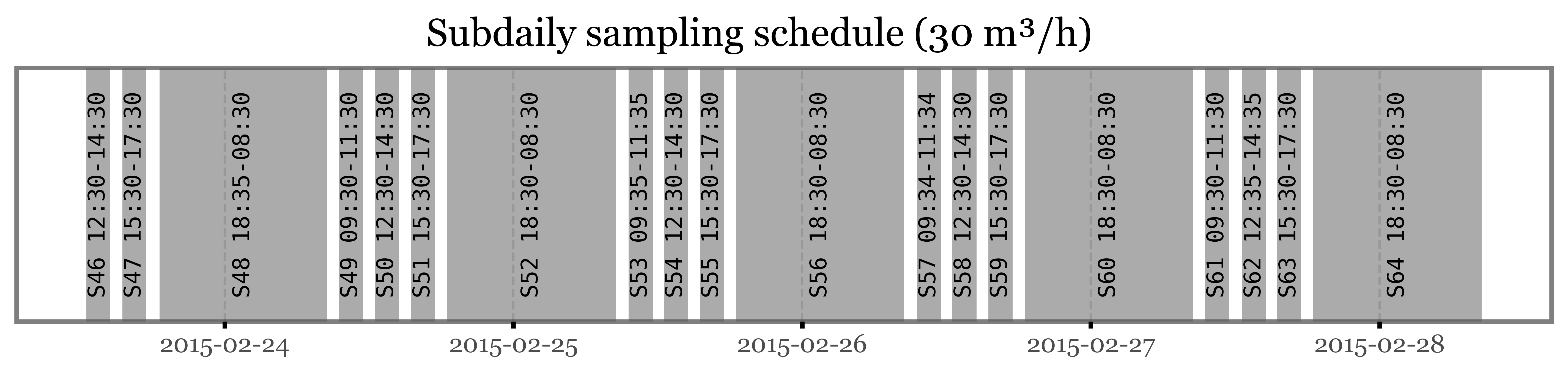
The actual hourly schedule of the intensive campaign is the following:
Show Code
(sample_timing
 .loc[lambda dd: dd.sample_id.isin(f'S{i}' for i in range(46, 65))]
 .groupby(['sample_id'])
 .apply(lambda df: df.iloc[0])
 .reset_index(drop=True)
 .sort_values('start')
 .assign(label=lambda dd: [f'{s} {i}-{e}' for s, i, e in
    zip(dd.sample_id, dd.start.dt.strftime('%H:%M'), dd.end.dt.strftime('%H:%M'))])
 .pipe(lambda dd: p9.ggplot(dd)
 + p9.geom_rect(mapping=p9.aes(xmin='start', xmax='end'), ymin=0, ymax=1, alpha=.5)
 + p9.geom_text(p9.aes(x='start + (end - start) / 2', label='label', y=.5),
                angle=90, family='monospace', size=10)
 + p9.labs(x='', y='', title='Subdaily sampling schedule (30 m³/h)')
 + p9.theme(figure_size=(12, 2),
            axis_text_y=p9.element_blank(),
            axis_ticks_major_y=p9.element_blank(),
            axis_ticks_minor_y=p9.element_blank(),
            panel_grid_major_y=p9.element_blank())
)
)
Sample S72: Mystery solved
So, if according to the schedule sample S72 was stopped after the second day, why do we even have the idea of it being so extra diverse?
Well, in reality, the sample S72 that was analyzed and showed such a high total diversity and abundance of microbial species was not a real sample, but a pool of the interrupted sample S72 plus all the subdaily samples taken during the intensive campaign (S46 to S64).
The reason this was done in the first place was to make a comparable sample to all the other weekly samples, which were generated by 7 days of sampling. However, the main issue here was not the aggregation of samples, but the fact that the subdaily samples were taken at different hours of the day, covering a much larger time window than the weekly samples which only included the diversity of species found in the 3 hours of sampling from 12:00 to 15:00.
As described in (1), microbial communities in the air are highly dynamic, and follow a diel cycle, with the highest diversity of species found during the day, but the highest abundance of total DNA found at night.
The following figure is adapted from the aforementioned paper, and shows the anticorrelated diel cycles of diversity and DNA yield of microbial communities in the air:
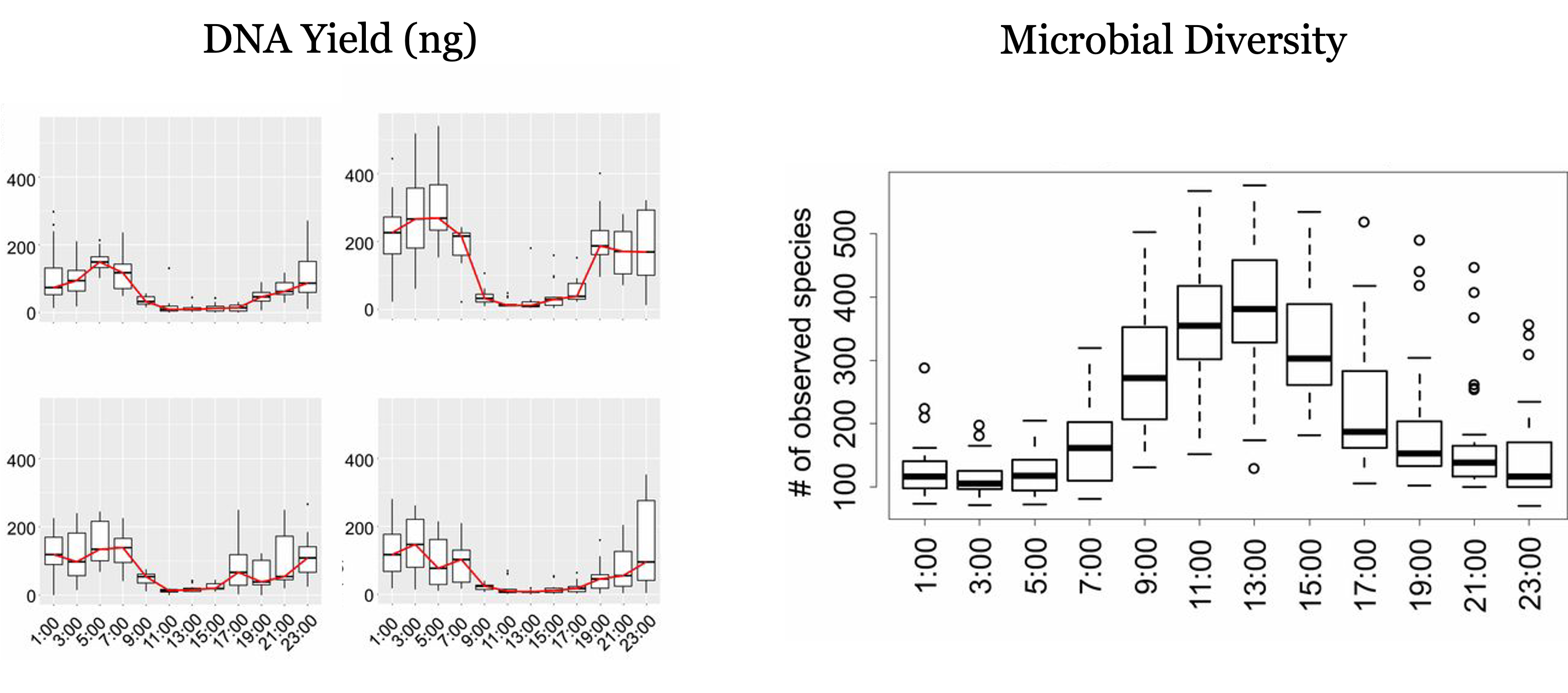
While our intensive campaign doesn’t include so many samples, we might be able to observe the diel cycle across the 4 different daily samples that we have for 5 different days. I explore this on another report that can be found here:
Yield, diversity and sample duration
From the information learnt in (1), and what has been confirmed in further studies (2, 3) we can conclude without further need of evidence that a longer coverage of hours within the day are necessary to capture the full diversity of microbial communities in the air.
This was already applied in the later campaigns performed in Kumamoto, and we will most likely repeat that strategy in the upcoming campaign too.
Nonetheless, there is a question that remains unanswered:
When using the HVS, how long can we sample for without compromising the quality of the recovered DNA? Is there degradation that leads to a loss of diversity?
We will try to answer this question by comparing the results of the amplicon sequencing using the weekly samples with the results of the daily and subdaily samples which covered the same time window.
There are two metrics to take into account: DNA yield and diversity. Since (at least by now) we don’t have the actual DNA yields in ng for each of the samples, we are going to use the total number of reads as a proxy for the DNA yield (this can be a bit misleading due to fluctuations in the amplification process). For diversity, we’ll focus on \(\alpha\)-diversity, which is the total number of species found in the sample.
Since we are not completely sure about the degree of accuracy of the identification at the Species level, we’ll do so at the Genera level, which is a more conservative approach but should lead to more robust results.
Dataset
I am going to use the dataset that was sent to me by Sílvia and is named NOTO_FINAL.xlsx. I couldn’t find the original either in the Cluster nor in Google Drive, but I believe it’s the correct one. We should probably map it back to the raw files somehow, but that’s for another day.
I’ll start by loading the data from both ITS and 16S results:
Show Code
taxons = ['Kingdom', 'Phylum', 'Class', 'Order', 'Family', 'Genus', 'Species']

noto_16s = (pd.read_excel('../data/NOTO_FINAL.xlsx')
            .iloc[:1465]
            .apply(lambda x: x.str.split('__').str[1] if x.dtype == 'object' else x)
            .assign(depth=lambda dd: dd[taxons].notna().sum(axis=1))
            .assign(depth_label=lambda dd: dd.depth.apply(lambda x: taxons[x - 1]))
            .assign(depth_label=lambda dd:
                    np.where(dd.depth==0, 'Unclassified', dd.depth_label))
            .fillna({t:  'Unclassified' for t in taxons})
)

noto_its = (pd.read_excel('../data/NOTO_FINAL.xlsx', sheet_name=1)
            .iloc[:1236]
            .assign(depth=lambda dd: dd[taxons].notna().sum(axis=1))
            .assign(depth_label=lambda dd: dd.depth.apply(lambda x: taxons[x - 1]))
            .assign(depth_label=lambda dd:
                    np.where(dd.depth==0, 'Unclassified', dd.depth_label))
            .fillna({t:  'Unclassified' for t in taxons})
)

sample_groups = (sample_timing
[['sample_id']]
 .drop_duplicates()
 .assign(number=lambda dd: dd.sample_id.str.lstrip('S').astype(int))
 .assign(group=lambda dd: dd.number.apply(lambda x: 'Daily' if x < 40 else
        ('Sub-daily' if x > 45 and x < 65 else 'Weekly')))
 )
DNA Yield - Total Reads
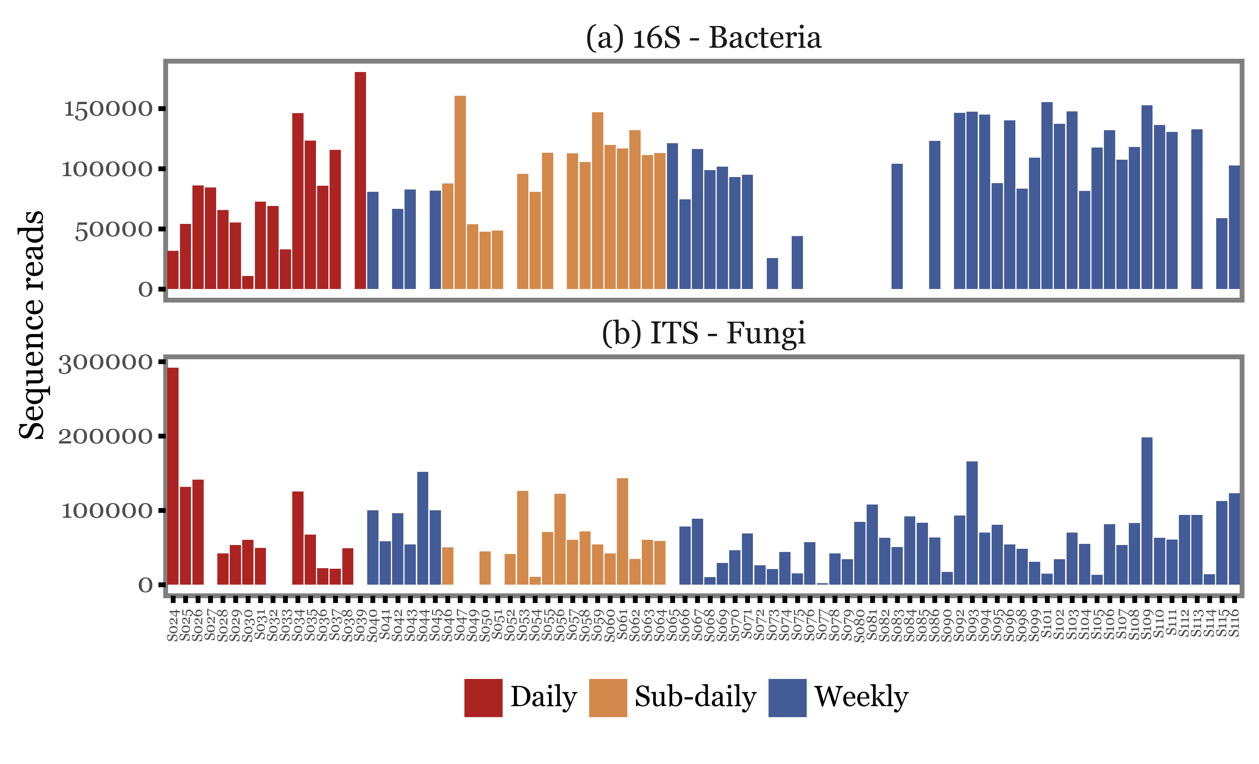
We can start by looking at how the total number of reads changes with the type of sample used. In the figure below, we just show the total number of reads (assigned at least up to the Genus level) for each of the samples, ordered by their sample IDs and colored according to the type of sample.
The first visual inspection seems to indicate that the total number of reads is rather variable, but the intra-group variance seems to be at least as big as the inter-group variance.
There could be some standardization/normalization step at the amplification stage that could lead the total number of reads to be a really bad proxy of the actual DNA yield, but let’s take it as it is for now.
Show Code
genera_reads = (pd.concat([noto_16s, noto_its])
            .groupby(taxons[:-1])
            .sum(numeric_only=True)
            .drop(columns='depth')
            .query('Genus != "Unclassified"')
            .groupby('Kingdom')
            .sum(numeric_only=True)
            .query('Kingdom != "Archaea"')
            .T
            .reset_index()
            .rename(columns={'index': 'sample_id'})
            .melt('sample_id', value_name='reads', var_name='Kingdom')
            .merge(sample_groups, on='sample_id')
            .query('reads > 0')
            .assign(sample_id=lambda dd: 'S' + dd['sample_id'].str[1:].str.zfill(3))
            .replace({'Kingdom': {'Bacteria': '(a) 16S - Bacteria',
                                  'Fungi': '(b) ITS - Fungi'}})
)

(genera_reads
.pipe(lambda dd: p9.ggplot(dd)
                + p9.aes('sample_id', 'reads', fill='group')
                + p9.geom_col()
                + p9.facet_wrap('Kingdom', ncol=1, scales='free_y')
                + p9.labs(x='', y='Sequence reads', fill='')
                + p9.scale_fill_manual(['#ab2422', '#D3894C', '#435B97'])
                + p9.theme(figure_size=(8, 4),
                           axis_text_x=p9.element_text(angle=90, size=6),
                           panel_grid=p9.element_blank(),
                           strip_background=p9.element_blank(),
                           strip_text=p9.element_text(ha='center'),
                           legend_position='bottom',

                )
 )
)
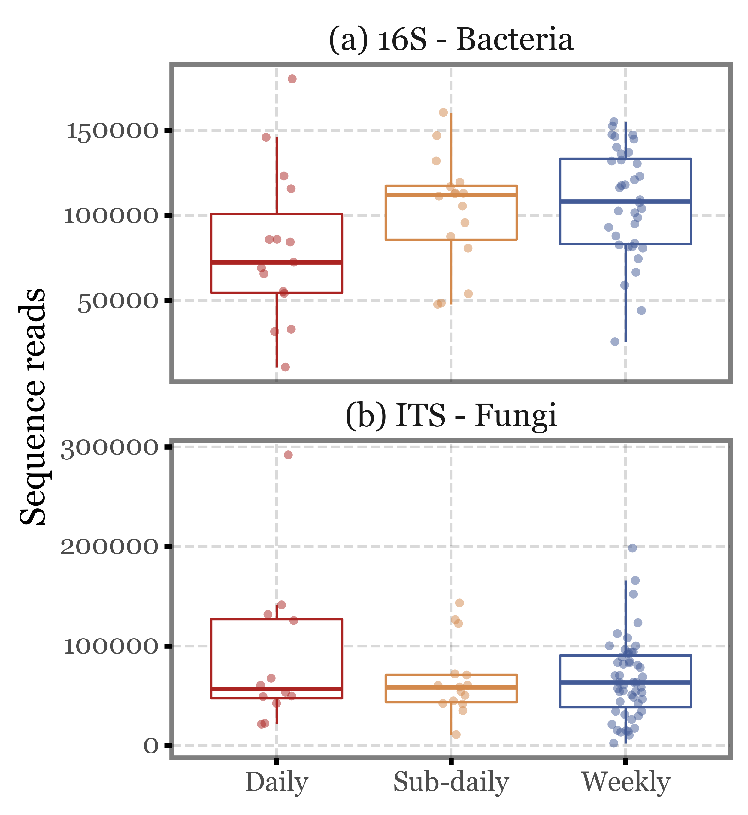
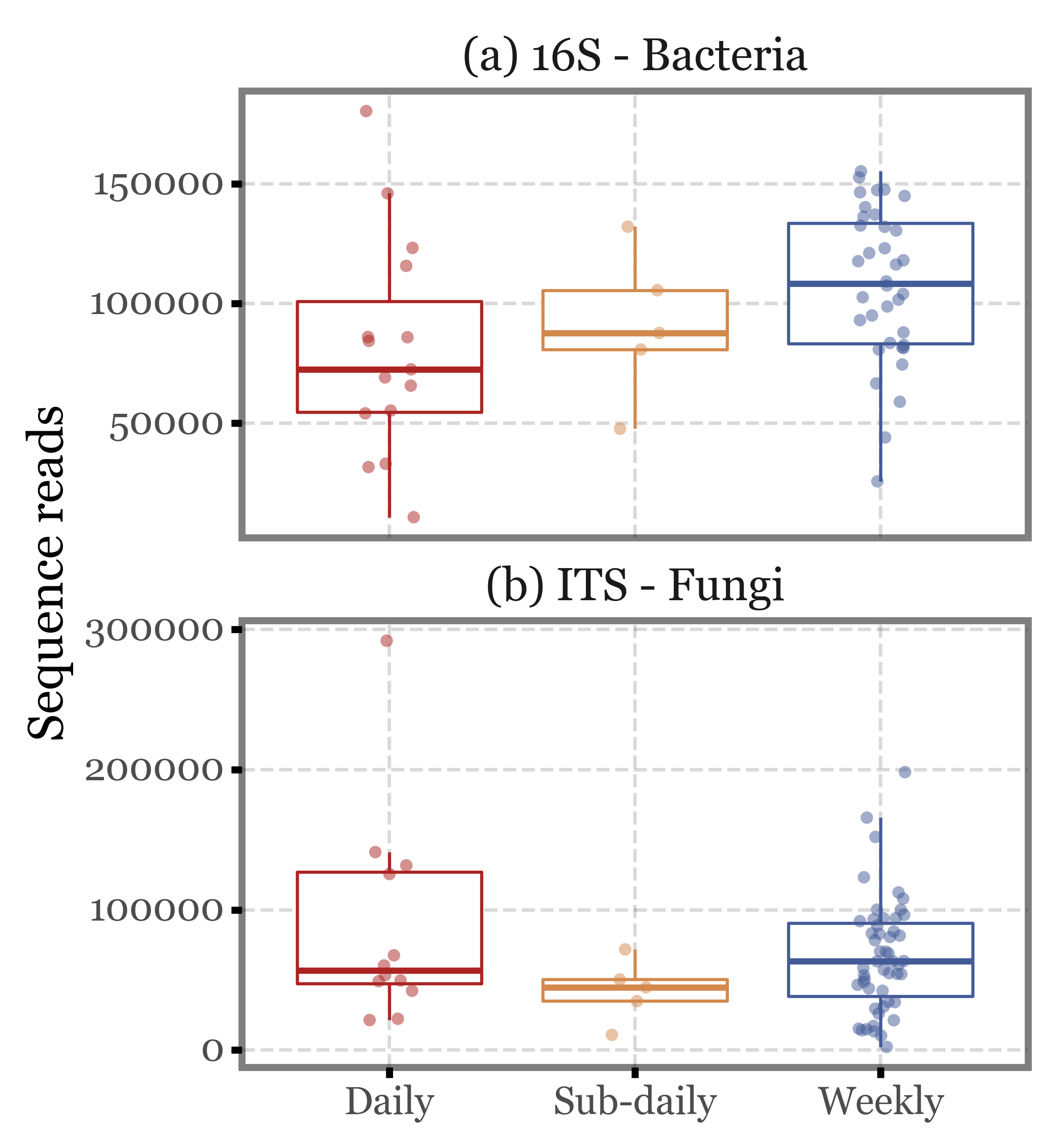
If we put the values into context and compare them using boxplots, we see how while the distributions do fluctuate, the median values are quite similar across the different sample types and the interquartile ranges overlap in all cases.
If we keep only the 4 subdaily samples that were taken during the comparable time-frame (12:30 to 14:30), the values barely change:
Show Code
(genera_reads
 .pipe(lambda dd: p9.ggplot(dd)
                + p9.aes('group', 'reads', color='group')
                + p9.facet_wrap('Kingdom', ncol=1, scales='free_y')
                + p9.geom_boxplot(outlier_alpha=0)
                + p9.geom_jitter(width=.1, size=2, alpha=.5, stroke=0)
                + p9.scale_color_manual(['#ab2422', '#D3894C', '#435B97'])
                + p9.labs(x='', y='Sequence reads', fill='')
                + p9.guides(color=False)
                + p9.theme(figure_size=(4, 5),
                           strip_background=p9.element_blank(),
                           )
 )
) 
Show Code
(genera_reads
 .assign(remove=lambda dd: (dd.group == 'Sub-daily') & (~dd.number.isin(range(46, 66, 4))))
 .query('not remove')
 .pipe(lambda dd: p9.ggplot(dd)
                + p9.aes('group', 'reads', color='group')
                + p9.facet_wrap('Kingdom', ncol=1, scales='free_y')
                + p9.geom_boxplot(outlier_alpha=0)
                + p9.geom_jitter(width=.1, size=2, alpha=.5, stroke=0)
                + p9.scale_color_manual(['#ab2422', '#D3894C', '#435B97'])
                + p9.labs(x='', y='Sequence reads', fill='')
                + p9.guides(color=False)
                + p9.theme(figure_size=(4, 5),
                           strip_background=p9.element_blank(),
                           )
 )
) 
Microbial Diversity
Let’s now focus not on the total amount of reads, but on the diversity of the samples:
Show Code
genera_diversity = (pd.concat([noto_16s, noto_its])
    .groupby(taxons[:-1])
    .sum(numeric_only=True)
    .drop(columns='depth')
    .query('Genus != "Unclassified"')
    .groupby('Kingdom')
    .agg(lambda x: (x > 0).sum())
        .query('Kingdom != "Archaea"')
            .T
            .reset_index()
            .rename(columns={'index': 'sample_id'})
            .melt('sample_id', value_name='diversity', var_name='Kingdom')
            .merge(sample_groups, on='sample_id')
            .query('diversity > 0')
            .assign(sample_id=lambda dd: 'S' + dd['sample_id'].str[1:].str.zfill(3))
            .replace({'Kingdom': {'Bacteria': '(a) 16S - Bacteria',
                                  'Fungi': '(b) ITS - Fungi'}})
)

(genera_diversity
.pipe(lambda dd: p9.ggplot(dd)
                + p9.aes('sample_id', 'diversity', fill='group')
                + p9.geom_col()
                + p9.facet_wrap('Kingdom', ncol=1, scales='free_y')
                + p9.labs(x='', y='Diversity (unique Genera)', fill='')
                + p9.scale_fill_manual(['#ab2422', '#D3894C', '#435B97'])
                + p9.theme(figure_size=(8, 4),
                           axis_text_x=p9.element_text(angle=90, size=6),
                           panel_grid=p9.element_blank(),
                           strip_background=p9.element_blank(),
                           strip_text=p9.element_text(ha='center'),
                           legend_position='bottom',

                )
 )
)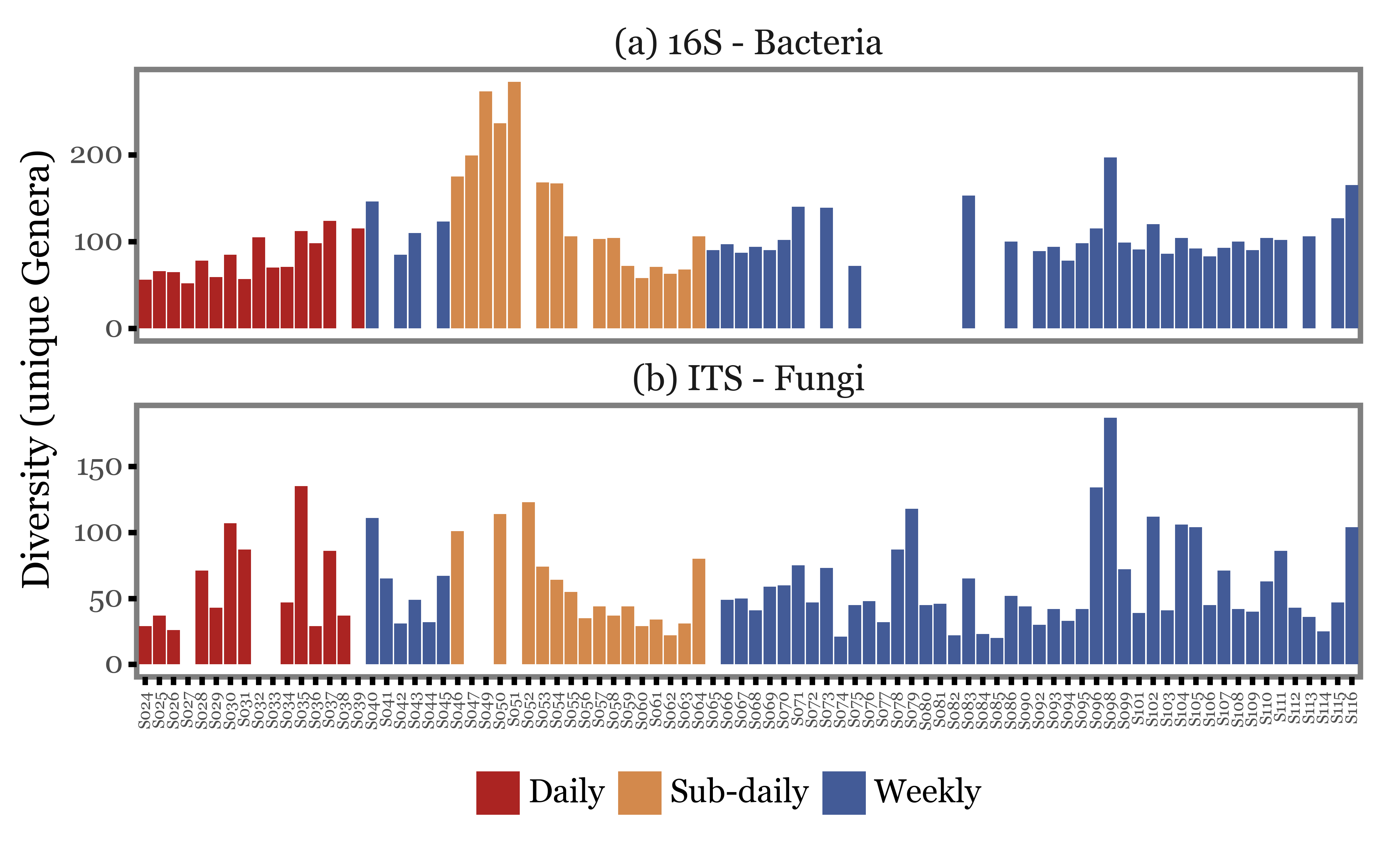
Once again, the first visual inspection seems to indicate that the diversity of the samples is rather variable but no strong patterns linked to the type of sample can be observed.
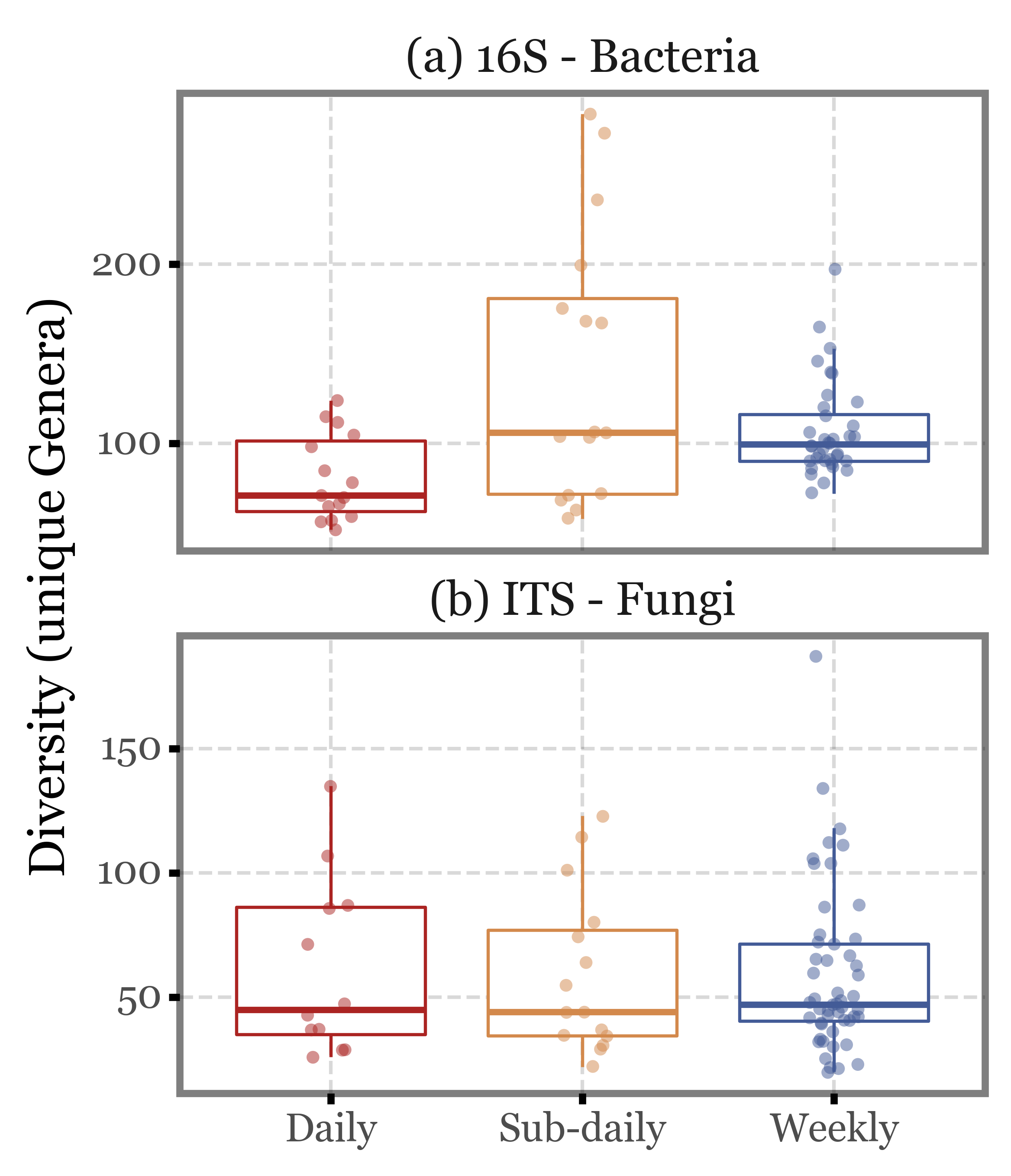
Let’s put it into a more analytical context by looking at the boxplots:
Show Code
(genera_diversity
 .pipe(lambda dd: p9.ggplot(dd)
                + p9.aes('group', 'diversity', color='group')
                + p9.facet_wrap('Kingdom', ncol=1, scales='free_y')
                + p9.geom_boxplot(outlier_alpha=0)
                + p9.geom_jitter(width=.1, size=2, alpha=.5, stroke=0)
                + p9.scale_color_manual(['#ab2422', '#D3894C', '#435B97'])
                + p9.labs(x='', y='Diversity (unique Genera)', fill='')
                + p9.guides(color=False)
                + p9.theme(figure_size=(4, 5),
                           strip_background=p9.element_blank(),
                           )
 )
) 
Show Code
(genera_diversity
 .assign(remove=lambda dd: (dd.group == 'Sub-daily') & (~dd.number.isin(range(46, 66, 4))))
 .query('not remove')
 .pipe(lambda dd: p9.ggplot(dd)
                + p9.aes('group', 'diversity', color='group')
                + p9.facet_wrap('Kingdom', ncol=1, scales='free_y')
                + p9.geom_boxplot(outlier_alpha=0)
                + p9.geom_jitter(width=.1, size=2, alpha=.5, stroke=0)
                + p9.scale_color_manual(['#ab2422', '#D3894C', '#435B97'])
                + p9.labs(x='', y='Diversity (unique Genera)', fill='')
                + p9.guides(color=False)
                + p9.theme(figure_size=(4, 5),
                           strip_background=p9.element_blank(),
                           )
 )
) 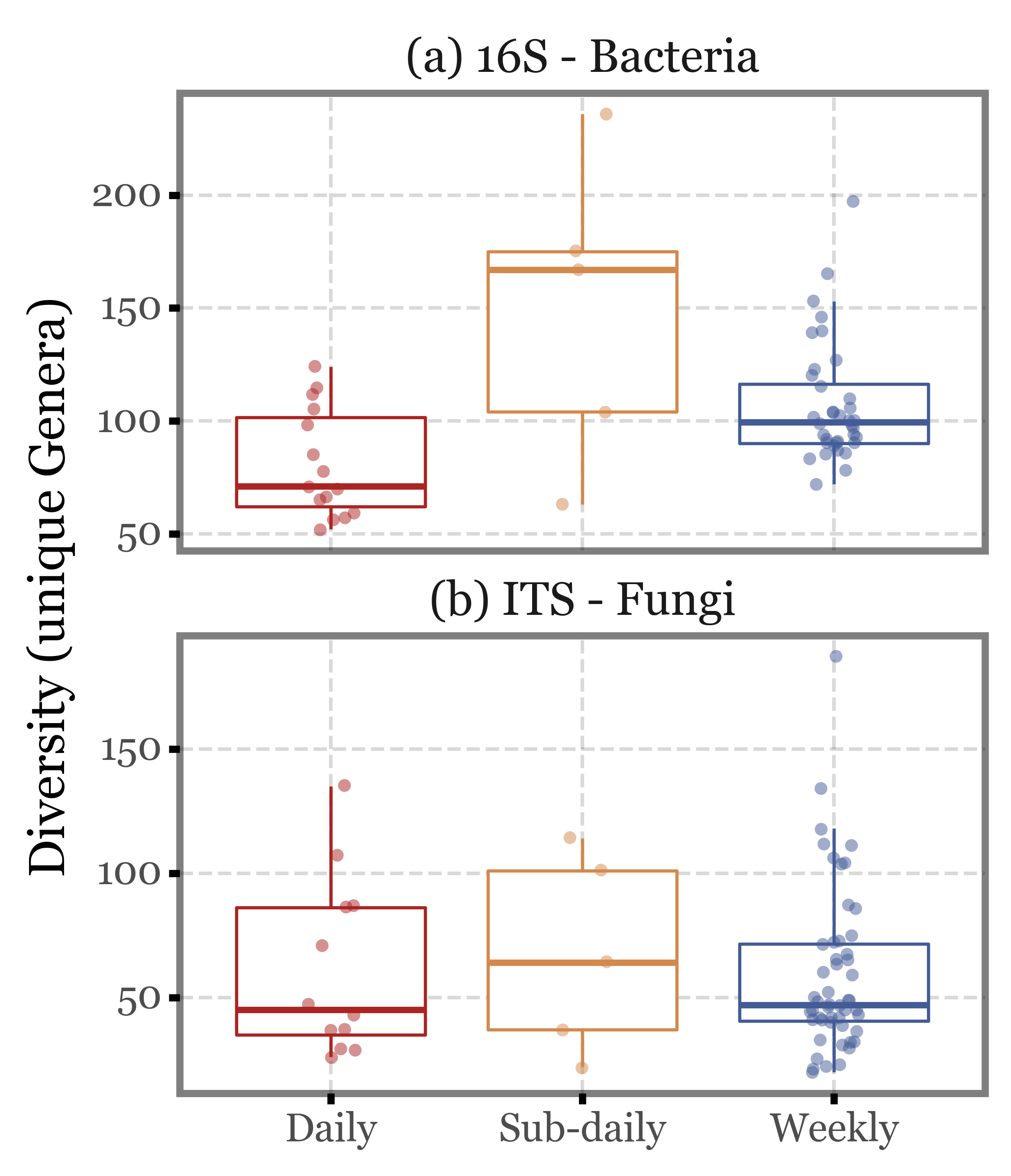
Again, the median values are quite similar across the different sample types both for ITS and 16S, and the interquartile ranges overlap in all cases. There are some outliers in the subdaily samples group, but they are not enough to change the overall picture.
Interpretation
We’ve seen how either sampling for a whole week (at intermitent hours), or for a single day, there is not much of a difference both in the total amount of sequence reads and in the microbial diversity of the samples.
If we take into account the fact that the weekly samples were actually a pool of 7 days, with around 7 times the air volume sampled, we certainly don’t see the expected linear increase in total read counts (maybe we do in DNA yield, however? That would be key to understand), so one could argue that the filter gets saturated after a while. Same goes for diversity of the samples, while we know that the composition of the microbial communities in the air is highly dynamic and changes strongly during a single day, we would also expect the cumulative number of species to increase as we sample for a full week compared to a single day. This is not the case, however, for these samples.
DNA Yield
UPDATE: We recovered the DNA yields for the samples, so are now able to actually find out if there is a difference in the DNA yield between the different sample types.
Let’s take a look at the DNA yield (in ng recovered) for each sample on a sample by sample basis:
Show Code
quant_df = pd.read_excel('../data/Llibreries 16S+ITS.xlsx')
quant_df.columns = ['sample_id', '_', '_', 'dna1', 'dna2', 'dna3', '_']
quant_df = (quant_df
  .replace('-', np.NaN)
  .replace('?', np.NaN)
  .replace('Higher than standard', np.NaN)
  .assign(dna1=lambda dd: dd.dna1.astype(float),
         dna2=lambda dd: dd.dna2.astype(float),
         dna3=lambda dd: dd.dna3.astype(float))
  .eval('dna = (dna1 + dna2 + dna3) / 3')
  [['sample_id', 'dna']]
  .merge(sample_groups, on='sample_id')
  .assign(sample_id=lambda dd: 'S' + dd['sample_id'].str[1:].str.zfill(3))
)


(quant_df
.pipe(lambda dd: p9.ggplot(dd)
                + p9.aes('sample_id', 'dna', fill='group')
                + p9.geom_col()
                + p9.labs(x='', y='DNA Yield (ng)', fill='')
                + p9.scale_fill_manual(['#ab2422', '#D3894C', '#435B97'])
                + p9.theme(figure_size=(8, 2),
                           axis_text_x=p9.element_text(angle=90, size=6),
                           panel_grid=p9.element_blank(),
                           strip_background=p9.element_blank(),
                           strip_text=p9.element_text(ha='center'),
                           legend_position='bottom',
                )
 )
)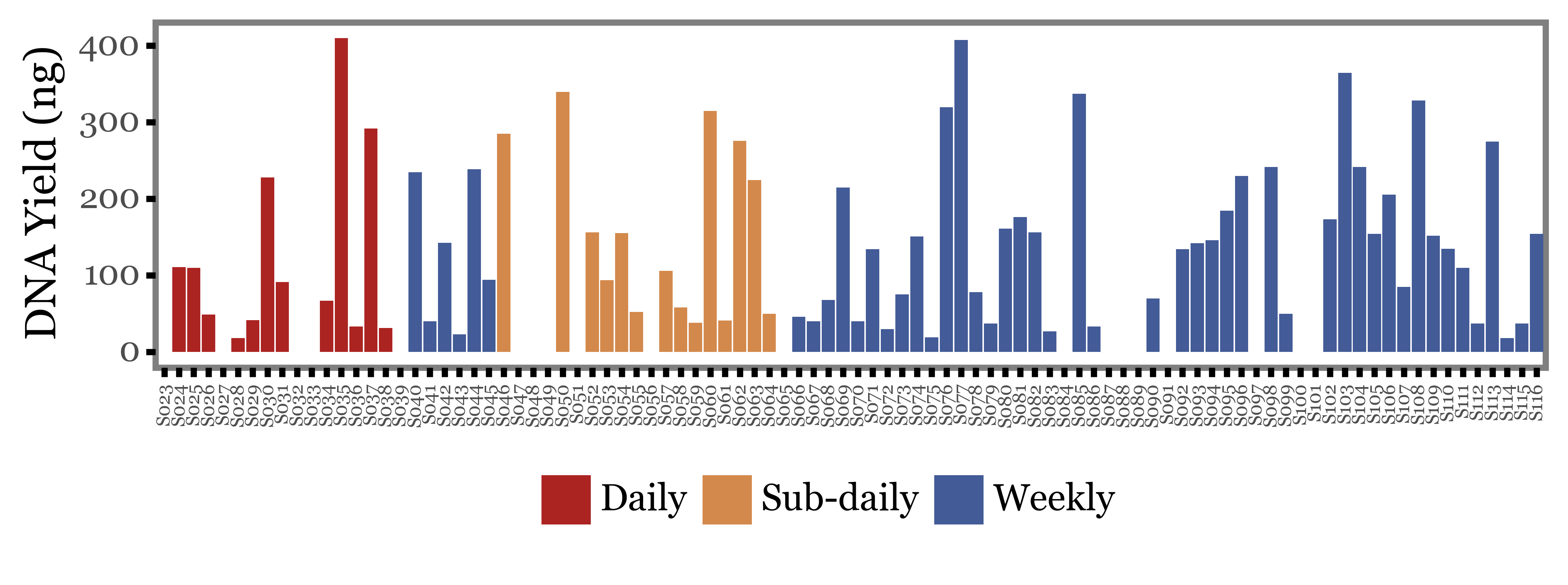
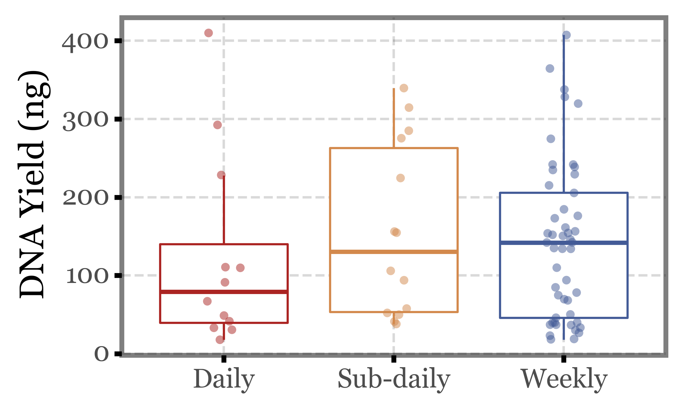
Again, huge variability, even more than in the previous metrics we evaluated. There are samples under 50 ng and over 300 ng in all three groups of samples.
If we put this into a boxplot, same realization as before:
Show Code
(quant_df
 .pipe(lambda dd: p9.ggplot(dd)
                + p9.aes('group', 'dna', color='group')
                + p9.geom_boxplot(outlier_alpha=0)
                + p9.geom_jitter(width=.1, size=2, alpha=.5, stroke=0)
                + p9.scale_color_manual(['#ab2422', '#D3894C', '#435B97'])
                + p9.labs(x='', y='DNA Yield (ng)', fill='')
                + p9.guides(color=False)
                + p9.theme(figure_size=(4, 2.5),
                           strip_background=p9.element_blank(),
                           )
 )
) 
What if we compare the DNA yield with the previous metrics used? Can we rely on it as a proxy for the total number of reads and the diversity of the samples?
Show Code
(quant_df
    .merge(genera_diversity[['sample_id', 'diversity', 'Kingdom']],
           on='sample_id')
    .pipe(lambda dd: p9.ggplot(dd)
                + p9.aes('dna', 'diversity', color='group')
                + p9.facet_grid(['Kingdom', 'group'], scales='free_y')
                + p9.geom_smooth(method='lm')
                + p9.geom_point()
                + p9.scale_color_manual(['#ab2422', '#D3894C', '#435B97'])
                + p9.theme(figure_size=(6, 4))
                + p9.guides(color=False)
                + p9.labs(x='DNA Yield (ng)', y='Diversity (unique Genera)',
                          title='DNA Yield vs Diversity')
    )
).draw()


(quant_df
    .merge(genera_reads[['sample_id', 'reads', 'Kingdom']],
           on='sample_id')
    .pipe(lambda dd: p9.ggplot(dd)
                + p9.aes('dna', 'reads / 1000', color='group')
                + p9.facet_grid(['Kingdom', 'group'], scales='free_y')
                + p9.geom_smooth(method='lm')
                + p9.geom_point()
                + p9.scale_color_manual(['#ab2422', '#D3894C', '#435B97'])
                + p9.theme(figure_size=(6, 4))
                + p9.guides(color=False)
                + p9.labs(x='DNA Yield (ng)', y='Total sequence reads (thousands)',
                          title='DNA Yield vs Total sequence reads')
    )
).draw()
;
''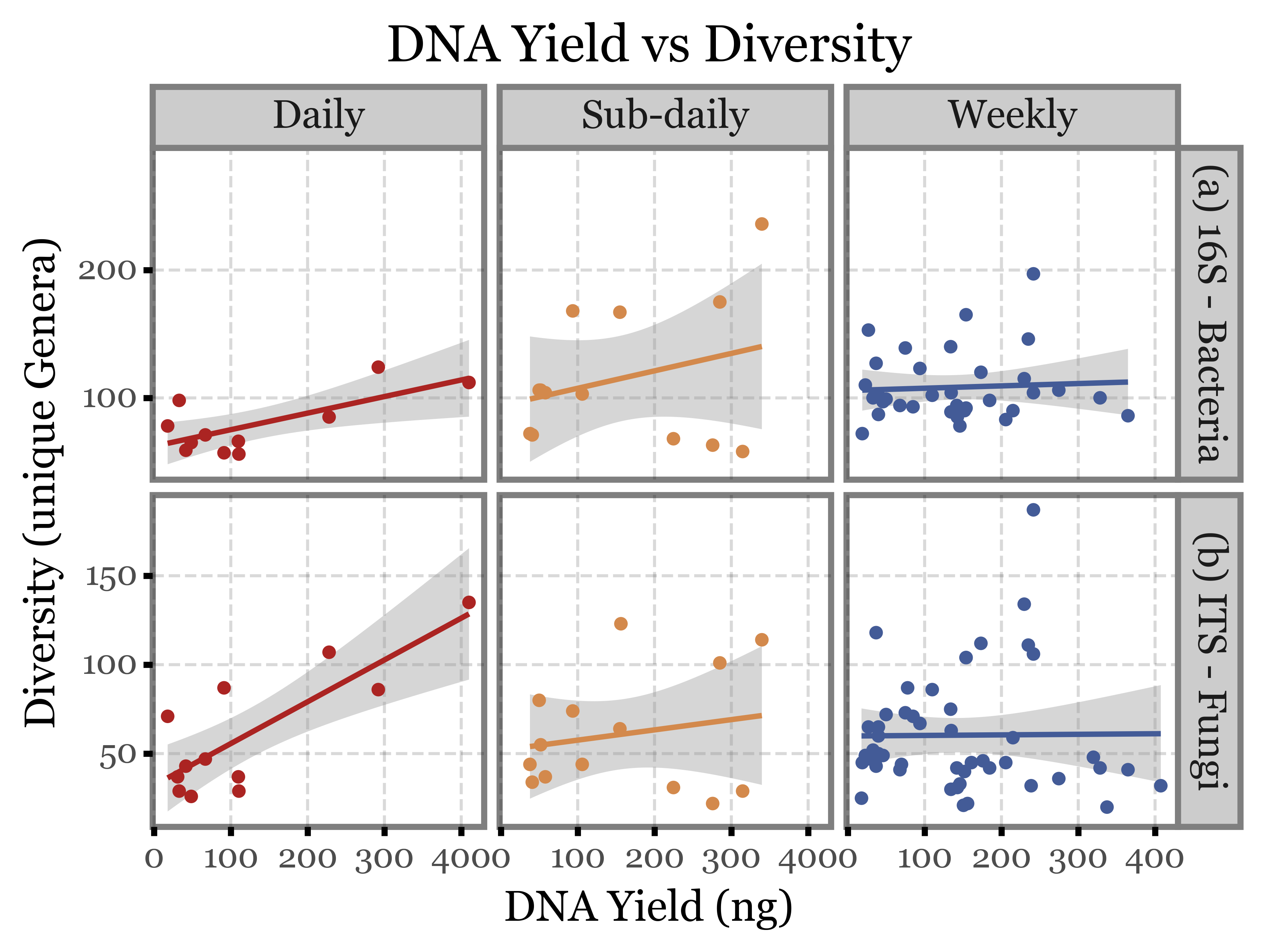
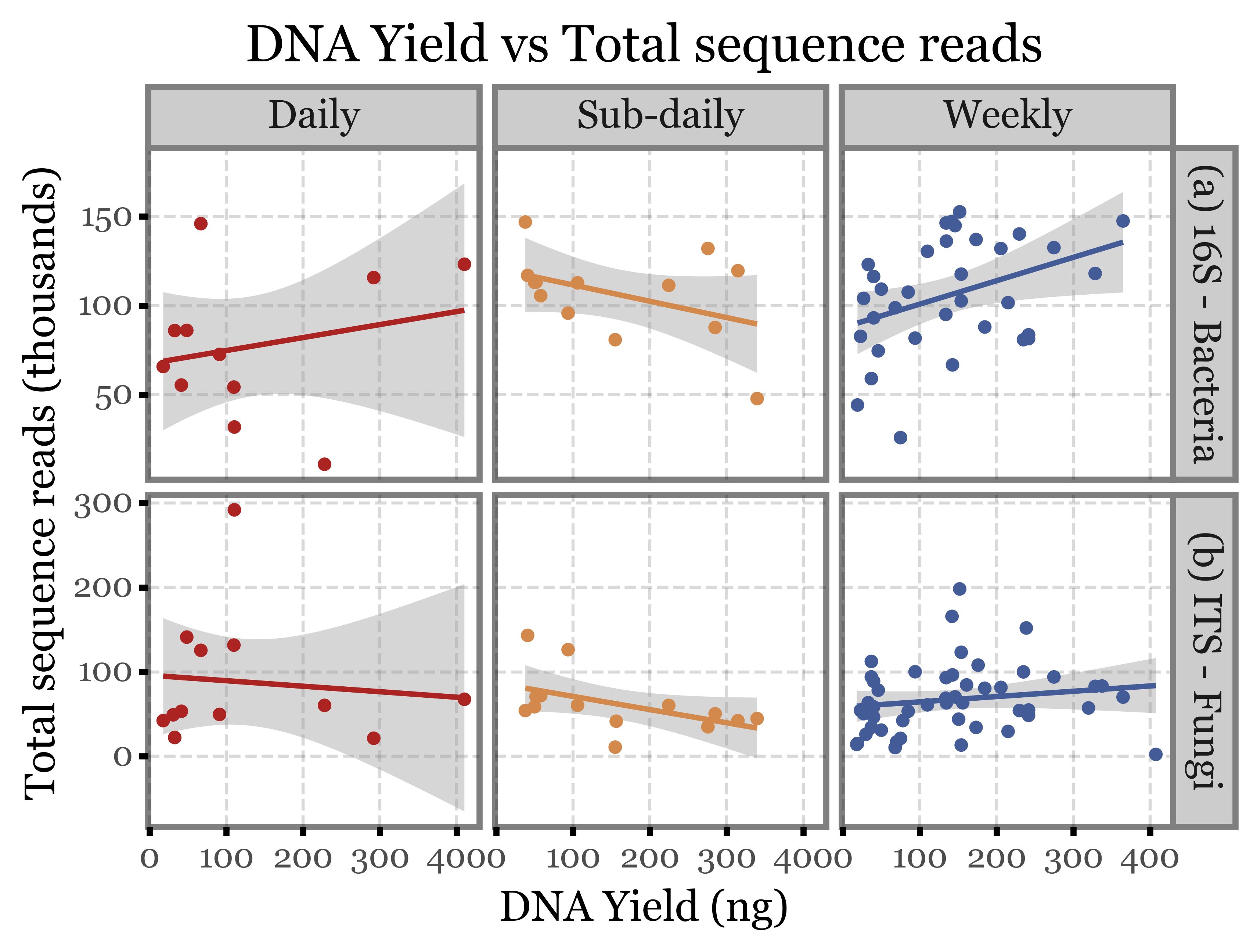
Apparently, not really, the correlation between DNA yield and the other two metrics is appalingly low.
Conclusions
There is not a significant difference between diversity nor total number of reads depending on the type of sample used (weekly, daily or subdaily).
The fact above mentioned could imply that the filter gets saturated or the DNA degradated as time goes by so that the weekly samples aren’t able to capture the full richness of the air communities during the whole period of time.
DNA Yield and DNA Quality stats would enable a proper comparison.
As it stands, we should sample for a whole day (as many hours as possible) to capture the full diversity caused by the diel cycle, and on a daily basis to avoid saturation/degradation problems (and moreover, to enable comparison with health outcomes at a daily resolution)
References
1.
E. S. Gusareva, et al., Microbial communities in the tropical air ecosystem follow a precise diel cycle. Proceedings of the National Academy of Sciences 116, 23299–23308 (2019).
2.
I. Luhung, et al., Experimental parameters defining ultra-low biomass bioaerosol analysis. NPJ biofilms and microbiomes 7, 1–11 (2021).
3.
D. I. Drautz-Moses, et al., Vertical stratification of the air microbiome in the lower troposphere. Proceedings of the National Academy of Sciences 119, e2117293119 (2022).